Storytelling with data - part 1
Notes I made while reading Storytelling with data: a data visualization guide for business professionals from Cole Nussbaumer Knaflic.
Chapter 1: The importance of context
- Exploratory: What you do to understand the data
- Explanatory: Selected knowledge with purpose
-
Use explanatory for presenting
- Who: Your audience
- Define specific
- Your relationship with the audience
- Expectations
- What: Action
- Propose, ask for action
- Choose right medium (presentation, email)
- Avoid mix and compromise (slideument)
- Choose the right tone
- How
- What data is there that is useful
- Ignore nonsupporting data
- Reduce to the max
- 3 Minute story
- Elevator pitch
Avoid PowerPoint early, use analog tool like storyboarding (PostIt notes)
Chapter 2: Choosing an effective visual
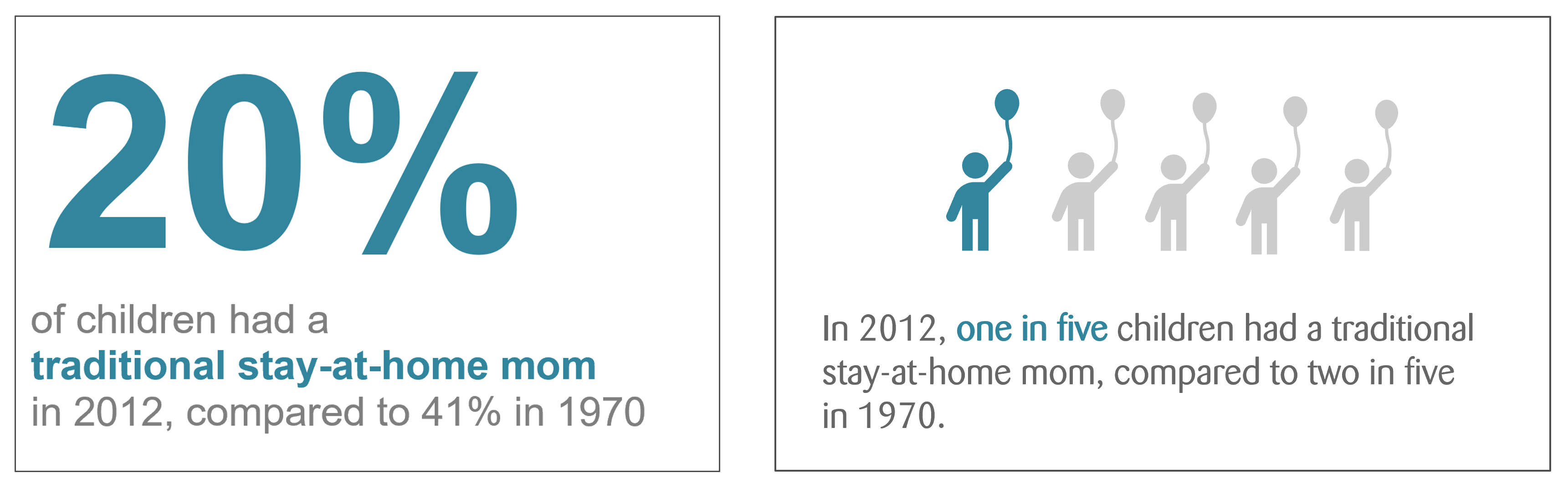
Simple text / Big number
One number that stays with the audience
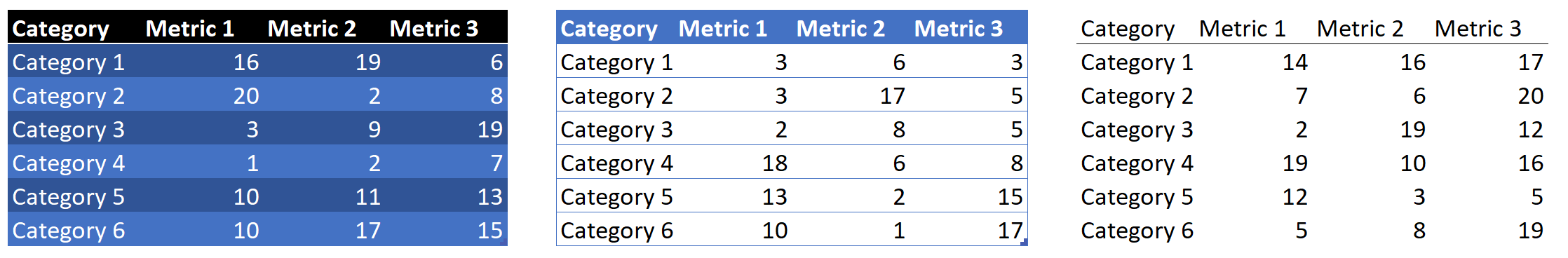
Tables
- Audience reads values from left to right
- Design should fade in the background, avoid fancy Excel formatting
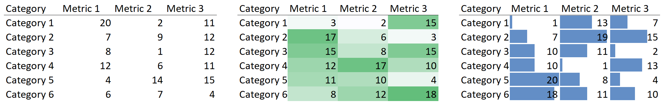
Heatmap
- Helps the reader to see the different values
- Make sure to add a legend to clarify the colors
Graphs
- Interact with visual system => processed faster
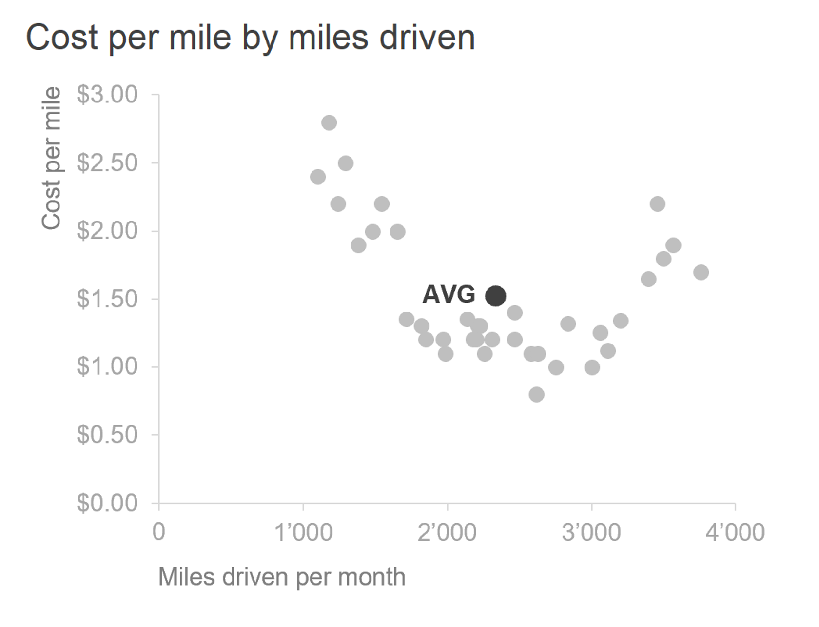
Scatterplot
- Shows datapoints on two axes
- Shows relationships of two things
- Discover trends and similarities
- Take time to explain to audience
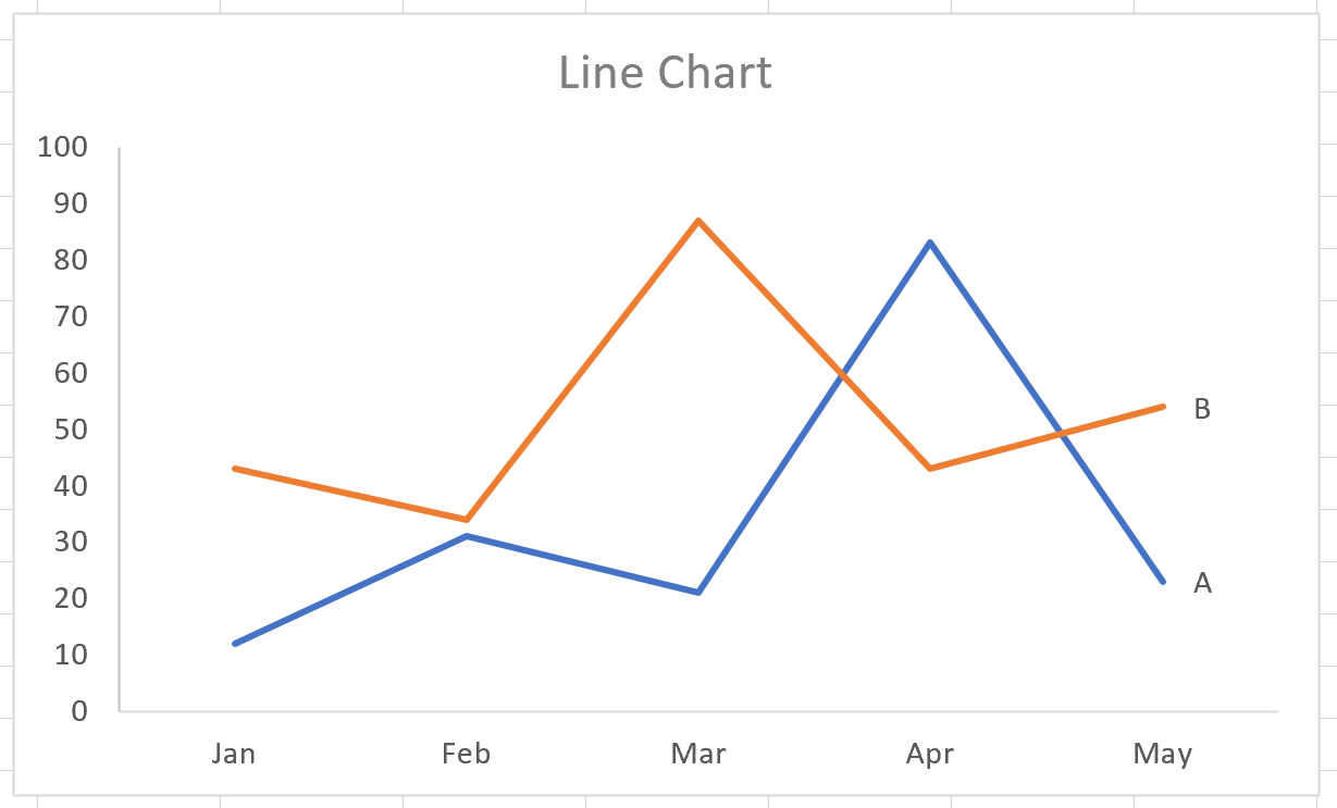
Line Graph
- Continuous data, often timeseries
- Label series directly
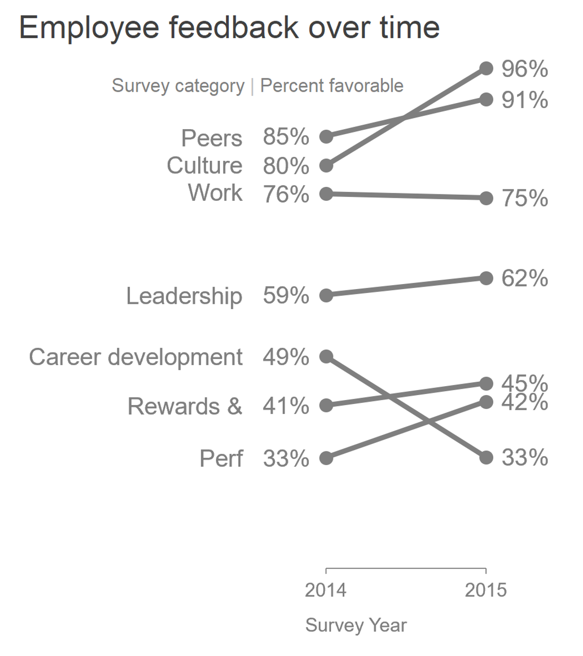
Slopegraph
- Two series of data
- Want to show the differences
- Example: Survey before/after on several topics
- Works best if lines do not overlap
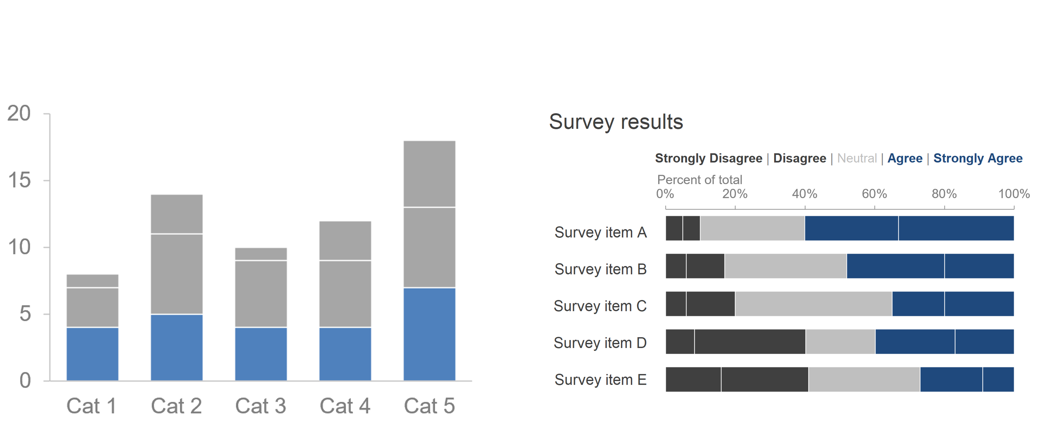
Bar chart
- Very flexible usage (vertical, horizontal, stacked, etc.)
- Easy to understand
- Good comparison between values
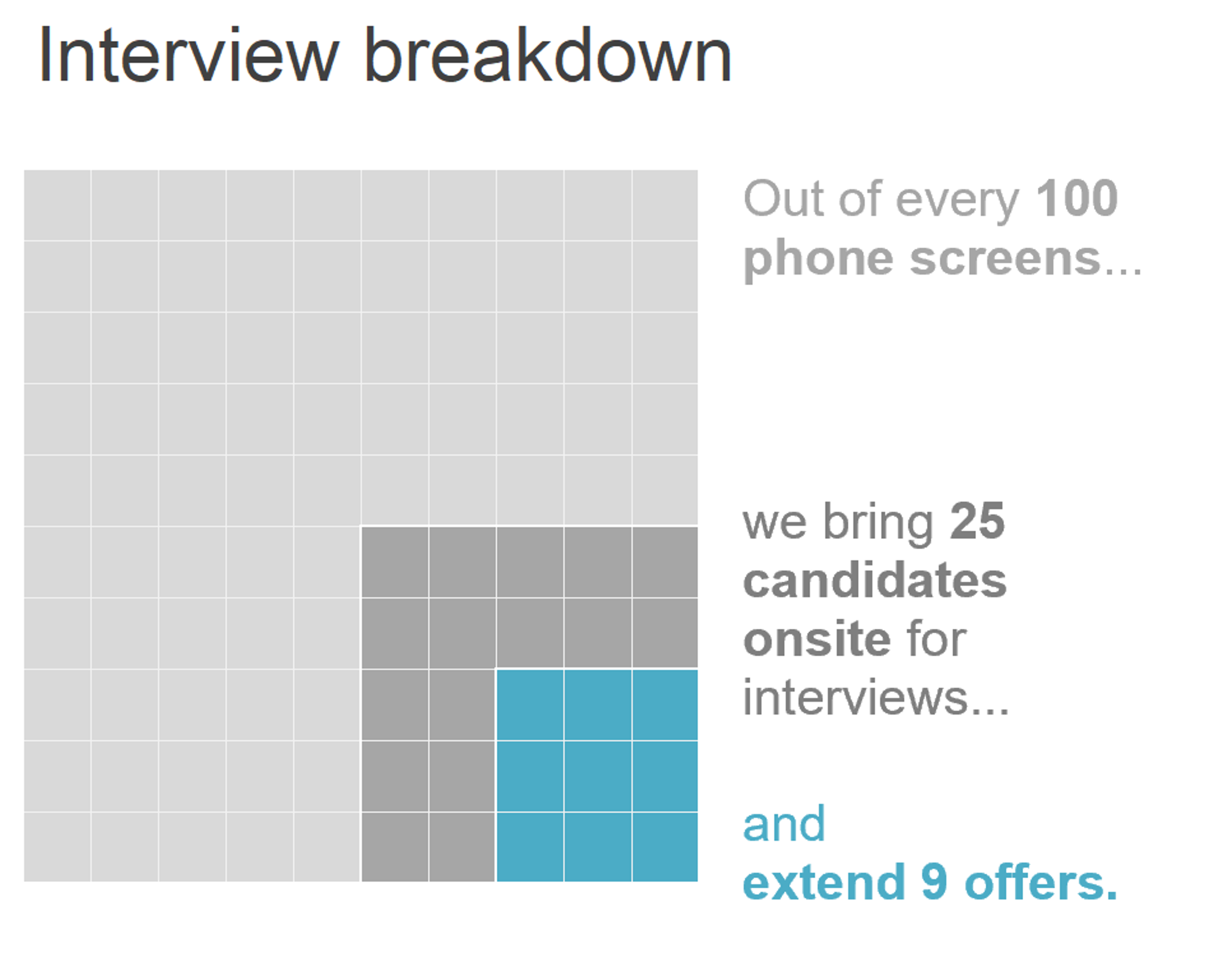
Area Graph
- Show relationship
- Use Rectangular shapes instead of round
Graphs to avoid
-
Everything with angles and round shapes (Pie charts, donut charts etc.). Reason: Humans are not good at estimating round areas and distances.
-
Graphs that are too complicated (Area charts, Bubble charts etc.). Too much information in one chart. This leads to a lot of effort of you explaining the graph instead of explaining your idea.
Image sources: Knaflic, Cole. Storytelling With Data: A Data Visualization Guide for Business Professionals, Wiley, © 2015.